PRODUCT UPDATE · 13 SEPTEMBER 2026 · SAM BAKKER
Introducing GoCushy V2: new checkout designs, a redesigned workspace, and a clearer way to sell
By Sam Bakker, founder of GoCushy
GoCushy V2 is live.
This release brings a redesigned merchant workspace, a much larger checkout design library, interactive buying examples, clearer order management, and an updated experience for connecting the tools behind your business.
The idea behind it is straightforward: your offer deserves a buying experience that makes sense to the person purchasing it—and you deserve a workspace that makes the everyday work of selling easier to follow.
Whether you are launching a course, opening a membership, selling a digital download or packaging your expertise into a paid offer, V2 gives you more ways to present that offer and manage what happens next.
You can use GoCushy directly in your browser. If you prefer working with a connected AI client, that remains another way to perform supported tasks. The redesigned workspace does not require an AI subscription or a desktop app.
Here is a detailed look at what has changed, how the new experience works, and where to start.
GoCushy V2 at a glance
The main changes are:
- A redesigned web workspace organised around Offers, Orders, Reports, Selling tools, Connections, Settings and Help, according to your account permissions.
- A checkout showcase with 26 examples, including 20 new layouts.
- More control over the presentation of your offer, including layout, colours, imagery and supporting content.
- Six interactive creator buying demos that show the journey from an initial introduction to a checkout and illustrative confirmation.
- Clearer order search, filtering and links to recorded payment-provider transactions.
- A more connected place to manage payments, email tools and other supported integrations.
- Refreshed Help and human-support access, with improvements for smaller screens.
Existing selling capabilities—such as bumps, upsells, subscriptions and coupons—remain part of the product. V2 gives those tools a clearer home and more flexible presentation. Existing lifetime rights remain in place, and classic dashboard access is retained.
1. A new workspace built around the work of selling
A seller’s day rarely follows the order of a software feature list.
You may start by checking whether an offer is ready, move to a customer’s order, investigate a payment, then return to editing a checkout. The new GoCushy workspace brings those jobs into a consistent interface.
Start with the overview
The overview brings together recent activity, selling figures and readiness information. It gives you a place to orient yourself before choosing the next task.
The “Next move” area helps surface unfinished essentials. Once those essentials are complete, it points you back toward reviewing your offers and orders rather than continuing to present setup as unfinished work.
That is the role of the overview: help you decide where to go next without making you search through every part of your account.
Move between the main jobs
The navigation groups work by purpose:
| Area | What you use it for | |---|---| | Offers | Create, review and manage the checkouts through which you sell | | Orders | Find a purchase, understand its contents and investigate what happened | | Reports | Review the sales and operational information available to your account | | Selling tools | Manage eligible promotions, affiliate activity and payment requests | | Connections | Set up and manage supported providers and services | | Settings | Manage your account and available controls | | Help | Ask a product question or contact human support |
What you see and can do still depends on your account and team permissions. The redesign does not give every team member access to every action.
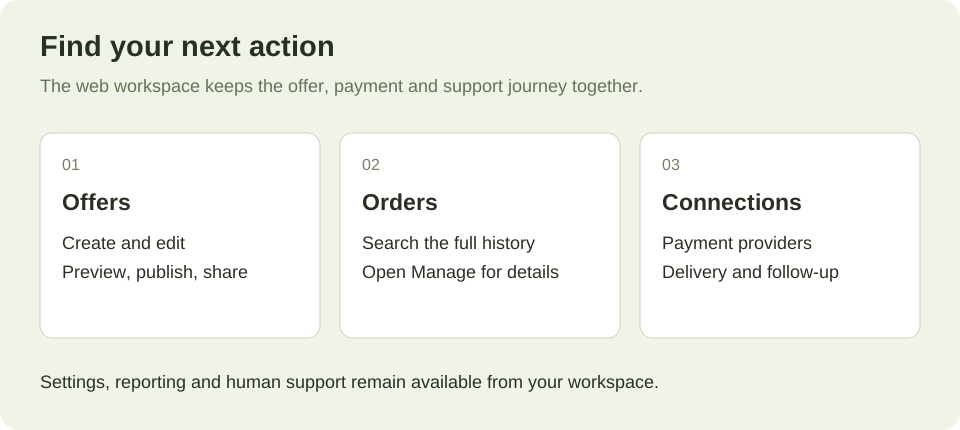
Workflow illustration, not a screenshot of a customer account. The new workspace brings the main selling jobs together.
2. Twenty new checkout layouts—and 26 examples to explore
One of the biggest visible changes in V2 is the checkout library.
Different products need different kinds of explanation. A course benefits from showing its curriculum. A visual product may need a gallery. A coaching offer may need room for a story. A membership may need a clear comparison between available choices.
The new library gives you different structures for those situations, rather than asking every offer to fit the same presentation.
Explore the full checkout showcase.
Tell the story behind the offer
For products that need context, several layouts give your explanation more space:
- Editorial rail: a story-led page with a section index and a persistent checkout rail.
- Magazine spread: an editorial composition with an asymmetric story and checkout further down the page.
- Chapter bands: a sequence of full-width sections that leads from the offer to payment.
- Cinema checkout: a media-led stage with payment beneath the story.
- Full-bleed canvas: expansive brand artwork with a floating checkout panel.
These structures let you organise the explanation around the buyer’s questions: what this is, why it matters, what is included and how to buy.
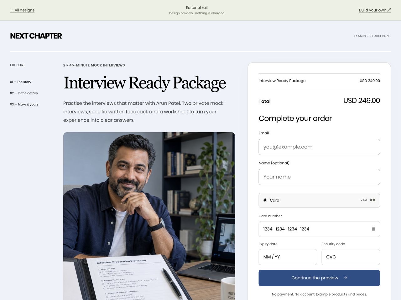
The fictional NEXT CHAPTER example uses Editorial rail to present a coaching package. Example prices and imagery are illustrative. Try the preview.
Give the product a stronger visual presence
Other layouts put the product itself at the centre:
- Product gallery: an expansive gallery with checkout in a drawer.
- Centerpiece: a centred product with benefits beside it and a payment section below.
- Modular mosaic: an asymmetric arrangement of imagery, story and checkout elements.
- Ticket: an event-style presentation with a distinct price section and payment below.
A layout is a presentation choice. For example, a ticket-style design does not itself create an event-management system. Physical-product examples also depend on seller-arranged fulfilment; the new designs do not add shipping labels or stock management.
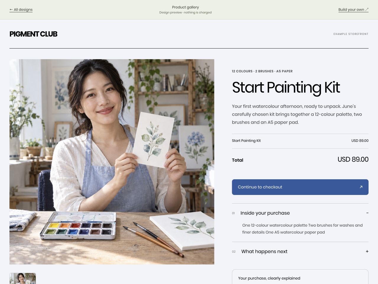
The fictional PIGMENT CLUB example shows how product imagery can lead the page. Open the interactive preview.
Guide the buyer through a more focused sequence
If you prefer a purchase organised into smaller steps, the library includes:
- Guided steps: details, optional extras and payment in a sequence.
- One question at a time: a focused progression through the purchase information.
- Side drawer: a full offer page with checkout alongside it.
- Expandable purchase dock: a story-led page with a bottom purchase control and payment sheet.
- Three-panel checkout: buyer details, payment and order information in separate columns.
- Express first: a compact presentation that gives available payment methods prominence.
Payment-method availability still depends on the connected provider, offer and buyer. Choosing a layout does not automatically enable every wallet or payment method shown in an illustrative example.
Make courses, plans and combinations easier to explore
Five more layouts focus on the shape of what you sell:
- Curriculum checkout: a course introduction with an expandable lesson outline.
- Plan picker: configured offers presented as cards before the selected checkout.
- Comparison checkout: explicitly selected offers shown for comparison.
- Inline offer accordion: offer choices that open into the selected purchase.
- Bundle builder: product and optional-extra selection with an order summary rail.
Plan picker, Comparison and Inline offers use offers you explicitly select. Each choice retains its own price, renewal and delivery terms. Bundle builder uses the existing cart items or eligible optional extras; selecting the design does not invent products or change their prices.
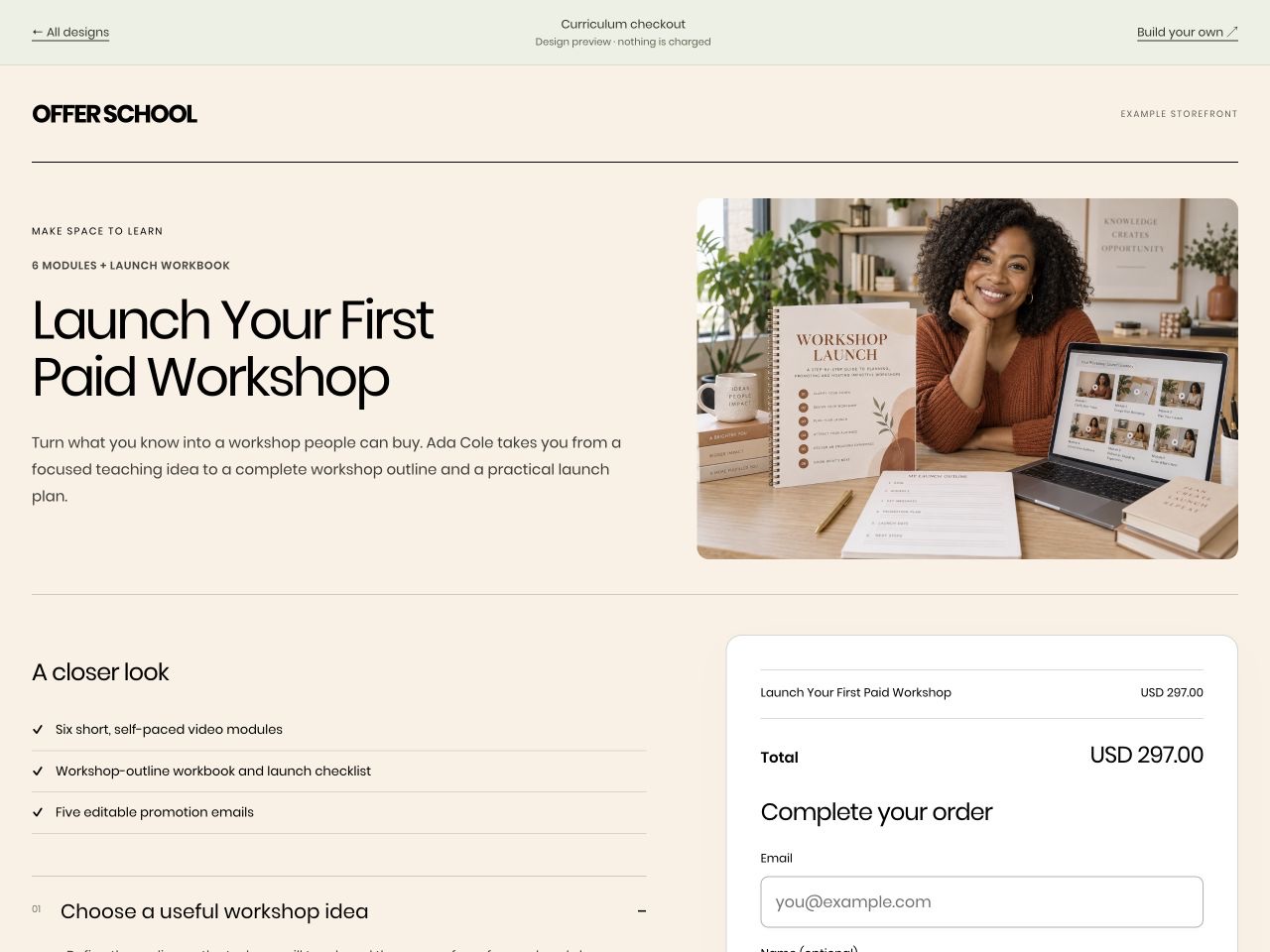
The fictional OFFER SCHOOL example gives the course outline a visible place in the buying decision. Explore the course preview.
Choose the structure, then make it yours
The new designs are independent of their example palettes. In the offer editor, you can choose a design and configure its supported colours, imagery, copy and content.
Preview the appearance, make your changes and save before sharing. The examples are a starting point for understanding the structure; your live offer should use your own product details and imagery you have permission to use.
It is worth trying a few structures with the same offer. The right choice is the one that presents the information clearly for your buyers. We are not claiming that one design automatically produces a particular conversion increase.
3. Six creator demos that show the whole buying journey
The updated website also includes six short creator buying demos.
Each starts with a fictional creator and follows an illustrative path through an offer, a prefilled checkout and a thank-you experience. You can play the sequence and see how the individual screens relate to one another.
The examples cover skincare, coaching, fitness, digital resources, travel and a road-trip guide. They give you a way to think about the transition from an introduction or social post to an actual purchase.
Play the creator buying demos.
These are demonstrations, not customer testimonials. The creators, engagement figures and purchases are illustrative, imagery is generated, and playing a demo does not charge, book or send anything. Social platform references do not imply a native social-shop integration.
The useful question to take away is: what would this journey look like for your own offer?
4. A clearer offer-editing experience
V2 connects offer creation, design and review more closely.
Start with what the buyer receives. Define the product and its delivery information, choose the checkout presentation, and configure suitable extras where they make sense.
The editor supports working with simple bumps and upsells, including creating a companion product when needed. You can review the presentation before sharing the offer.
There is also an important distinction between an offer and a shared product. A product can appear in multiple offers. When you change its price or delivery information, you should understand which checkouts use it.
The product-editing experience makes those linked checkouts visible so you can review the wider effect of a change. Existing subscription agreements remain intact; editing a product is not a shortcut for rewriting the terms already sold to subscribers.
The practical workflow is:
- Define the product and delivery.
- Choose how to present it.
- Add relevant optional extras.
- Preview and save.
- Test the buying journey before sharing it.
5. Order management that helps you investigate the actual purchase
When a customer asks about an order, the most useful next step is finding the record behind the question.
Order search and filters in the new workspace work across the order history, rather than only searching recent rows already displayed on screen. You can narrow the scope and export the corresponding records to CSV.
Open an order to review its purchase information, payment items, receipt and available actions. Where recorded provider details exist, transaction links take you to the corresponding payment in Stripe, Airwallex or PayPal. You can also use the saved reference to investigate in the receiving account.
That makes the workspace useful for questions such as:
- Which offer did this customer purchase?
- Did they include an optional extra?
- Which payment record belongs to the order?
- What receipt and delivery information are associated with it?
Permissions and the actual order state still determine the actions available.
6. Connections closer to the work they support
Selling usually involves more than the checkout alone. You may have a payment account, an email platform, accounting software and notification channels to manage.
The Connections area brings supported services into the workspace alongside the offers and orders they support. Existing permission and credential checks remain in place.
GoCushy continues to support connected payment providers and 15 email-platform integrations. Availability depends on the service, account and configuration. You choose the purchase events and follow-up behaviour that fit your business, while marketing messages still require the appropriate consent.
Your connected payment provider processes transactions and manages payouts. GoCushy does not hold your merchant funds.
7. Affiliate management and referral earnings have clearer places
For accounts with affiliate-management access, Selling tools → Affiliates brings the merchant’s programme into the new workspace.
You can work with referral links and commission records, and view the affiliate’s private portal information. Commission tracking includes holdbacks and refund adjustments. Payouts are made through your own arrangements and then marked paid in GoCushy; recording a payment in the ledger is not an automatic transfer.
There are two different activities here:
- Affiliates promoting your products and earning commission from your business.
- You referring buyers to GoCushy and earning GoCushy referral commission.
Your GoCushy referral earnings appear separately in Reports. The personal sharing tools and promotional resources for those referrals remain available through classic dashboard access.
The distinction helps keep your selling results, amounts owed to your affiliates and your own referral earnings understandable.
8. Help that keeps a human route available
The Help experience has been refreshed to fit the new workspace.
Cush provides a place to ask questions about GoCushy and, where enabled and permitted, your own account information. If you need a person, you can choose Message a human and send a support request.
We have also been refining the mobile experience, including readiness-card wrapping and Help when the phone keyboard reduces the available space. In the compact Help layout, optional content steps aside so the composer and human-support route remain reachable, and the support form can scroll within the drawer.
As with any interface change, real device feedback matters. If something does not work as expected on your phone or browser, please tell us what you were doing so we can investigate.
There is a real person behind GoCushy. I want support to remain part of using the product, not something you have to hunt for after getting stuck.
9. Use the dashboard directly—or connect your AI
The new web interface is a complete way to work with GoCushy’s supported selling tasks. You do not need a desktop installation, Pitch or an external AI subscription to use the dashboard.
A connected AI client can provide another way to perform supported work through the permissions you grant. You still need to review what it creates, check the price and delivery, and test before sharing.
V2 does not turn future portfolio ideas into included products. Pitch, ProductPay, desktop and local-AI plans are separate from the GoCushy capabilities described here. Some accounts already have specific Pitch entitlements; this release has not enabled Pitch for everyone.
The focus of this launch is the GoCushy experience available now.
10. What changes for existing customers?
The redesigned workspace is now enabled across production accounts, with navigation and actions reflecting each account’s permissions.
Existing accounts and order history have been retained. Existing lifetime rights remain in place, and the classic dashboard is still available for workflows that use it or when you prefer the familiar interface.
You do not need to buy a new founding membership just because the interface has changed. Your existing purchased rights continue to apply; particular features may still depend on your plan or pack.
Log in to your GoCushy account and start by opening an existing offer. Review the new design options, try a preview and explore the Orders and Connections areas.
11. Joining GoCushy: monthly or founding membership
If you are new to GoCushy, the current monthly plan is US per month after a 30-day free trial, with 0% added GoCushy platform fees while subscribed. A card is required. Payment-provider fees and applicable tax remain separate.
See the monthly plan and its current terms.
The dedicated founding offer is also available:
- US5 once for lifetime GoCushy access under the founding membership terms.
- No recurring GoCushy membership subscription for that membership.
- 0% added GoCushy platform fees on the founding account.
- Three team seats included.
- A 30-day founding membership refund window.
The optional US one-time Worldwide Tax & Affiliates Pack adds the specified tax, invoicing, Xero and affiliate tools. Membership plus pack is US0 before applicable tax. The monthly plan includes the Tax & Affiliates capabilities; founding buyers choose the optional pack if they need them.
Your provider’s processing fees remain separate on either option. Lifetime membership is access to the hosted service under its terms, not ownership of the software. Please review the current offer details before purchasing.
Explore the GoCushy founding membership.
Start with one offer
You do not need to use every feature in V2 immediately.
Choose one product you want to sell. Explore a few checkout layouts. Make the inclusions, price and next steps clear. Check the buying journey on a phone as well as a larger screen. Then save, test and share.
That is what we want GoCushy V2 to support: your work becoming an offer someone can understand, purchase and receive—with a clearer workspace for the person behind it.
I would love to see what you create.
— Sam Bakker, founder of GoCushy
Explore the new checkout designs · Try the creator demos · Open your workspace