6 checkout page design examples (built by AI, live to click)
Most "checkout page examples" posts show mockups you can't touch. These six are live pages — hero banner, product spotlight, minimal one-column, honest countdown, social proof, and a full funnel with a bump and upsell. Each section explains why the design works, so you can apply the reasoning on any platform, then click through to the real thing.
A checkout page has one job: hold the buyer's "yes" for the thirty seconds it takes to type a card number. Every design decision either protects that yes or chips away at it. Below are six designs that each protect it in a different way — because the right layout depends on your product and how warm your traffic is, not on someone else's favourite template.
One note up front: all six examples are live demo pages built with GoCushy. Every one of them was created by an AI agent from a single chat message — the exact copy-paste prompts are on the showcase page. The design lessons, though, apply anywhere.
1. Hero banner — sell the feeling one last time
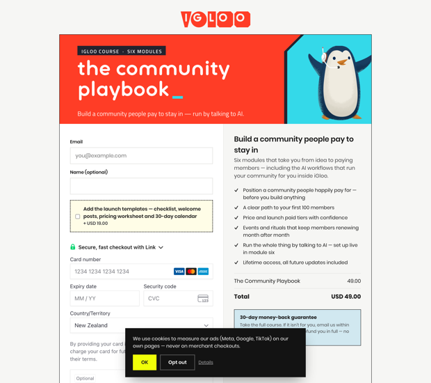
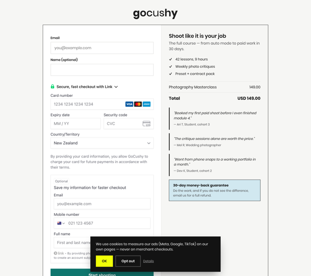
A full-width banner image, a headline about the transformation, three benefit bullets, then the payment form. This layout works for memberships, communities and coaching — anything where the buyer is purchasing a feeling of belonging or momentum rather than a file. The reasoning: at the moment of payment, doubt spikes. A hero banner re-sells the promise right where the doubt happens, instead of greeting the buyer with a cold order summary. Keep the bullets to three; the page's job is reassurance, not a second sales letter.
2. Product spotlight — make it concrete
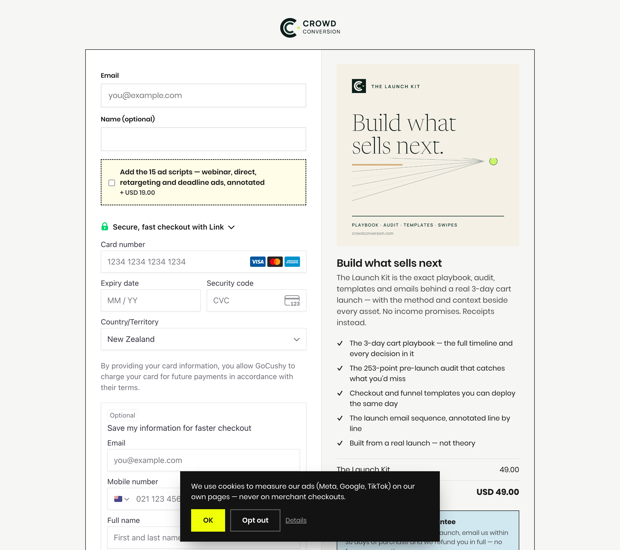
The product image sits directly beside the price and the card field. This is the layout for anything the buyer can picture: templates, presets, printed goods, a course with a strong visual identity. People part with money more easily for things they can see. The mistake to avoid is using a moody lifestyle shot — the spotlight image should be literal, showing exactly what arrives after payment. If the buyer can mentally place your product on their desk or screen, the price feels like a trade, not a leap.
3. Minimal one-column — match warm traffic
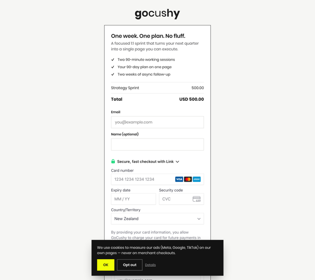
One column. Name, email, card, button. No banner, no bullets, no badges. This is the right design when the selling already happened somewhere else — a sales page, a webinar, an email sequence. For a buyer who arrives pre-sold, every extra element on the checkout is a fresh decision, and fresh decisions are exits. Match the page to the traffic temperature: cold traffic needs reassurance (designs 1, 2 and 5); warm traffic needs the shortest possible path. If your traffic comes from your own list, this quiet page is usually the strongest choice.
4. Honest launch countdown — a deadline that's actually real
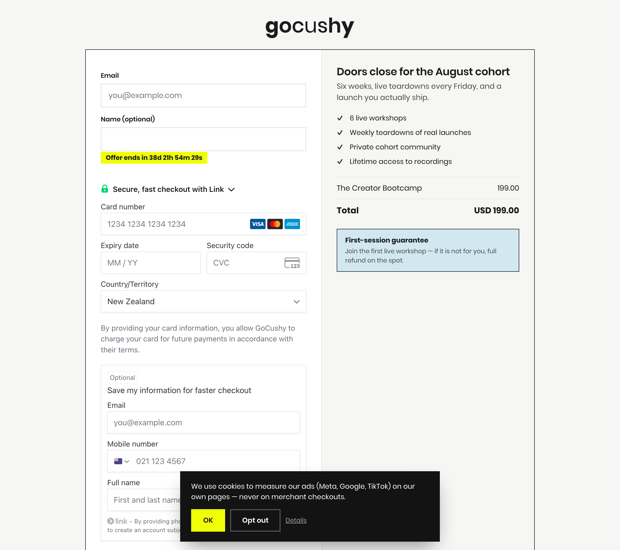
A deadline banner, urgency copy and a coupon field. Deadlines convert because they compress a decision that would otherwise drift — but only if they're true. Fake evergreen timers that reset per visitor train your audience to ignore every deadline you'll ever set, and in some markets they run into consumer-protection law. The countdown in this example deletes itself when it hits zero, and the platform rejects deadlines set in the past. If you use this pattern anywhere, hold the same line: when the timer ends, the offer genuinely changes.
5. Social proof — put the reassurance where the anxiety is
Testimonials placed next to the payment fields, not banished to the bottom of a sales page. The buyer's last unspoken question is "did this work for someone like me?" — so answer it at the exact spot where their cursor hovers over the card field. Specific quotes ("I shipped my first funnel in a weekend") beat star ratings and vague praise. One rule is non-negotiable: the testimonials must be real, from actual customers who gave permission. Invented reviews aren't just an ethics problem — regulators in the US, UK and EU now treat them as one too.
6. Funnel with bump and upsell — earn more from the same yes
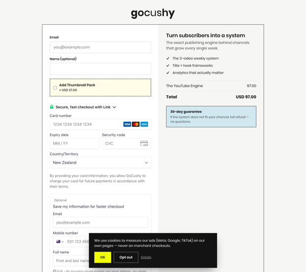
A main offer, a small order bump at the checkout (one checkbox, a complementary add-on at a small fraction of the main price), and a one-click upsell after payment. The reasoning: the moment right after someone says yes is the cheapest place to increase order value, because the buying decision has already been made. The bump should feel like an obvious companion — a workbook with a course, templates with a membership — never a second pitch. And because the upsell comes after the card is charged, it can't cost you the original sale.
Which one should you use?
- Cold traffic, emotional product — hero banner or social proof.
- Visual product — product spotlight.
- Warm list traffic — minimal one-column.
- Genuine launch window — honest countdown.
- Any offer with a natural add-on — funnel with bump and upsell, layered onto whichever base design fits.
We're not going to pretend these examples come with conversion statistics — they're demo pages, and any percentage we quoted would be invented. The honest claim is smaller: each design applies a well-understood principle (reassurance, concreteness, friction removal, true scarcity, proof, post-purchase economics), and the only way to know which wins for your offer is to try it on your own traffic.
How these six pages were actually made
Nobody designed these in a page builder. Each one was created by an AI agent — ChatGPT, Claude or Cursor connected to GoCushy over MCP — from one chat message: "create a $39/month membership with a hero banner layout…" and back comes a live, payable checkout link. Layout, colours, bump, upsell, coupon, deadline — all set in the same message. The showcase page has the exact prompt for every design on this page, ready to paste.
Payments settle on your own Stripe or PayPal account — GoCushy never holds your money. GoCushy itself charges 0% platform fees on your sales; you still pay your payment processor's standard rate, which is Stripe's or PayPal's, not ours.
$99 a month. Everything included, 0% added platform fees.
Your AI builds pages like the six above with one message — and the money lands in your own Stripe or PayPal.
Start free trialFirst 30 days free, cancel any time. You pay your processor's standard rate; GoCushy adds nothing on top.
Want to test-drive a design first? Open the showcase, copy a prompt, and paste it into your AI. If it comes back with a live link, you'll know everything on this page was real.
Selling with AI, in your inbox
Get each new post as it publishes — checkout tactics, agent workflows, and the real numbers from building GoCushy in public. Unsubscribe anytime.
